Onkod
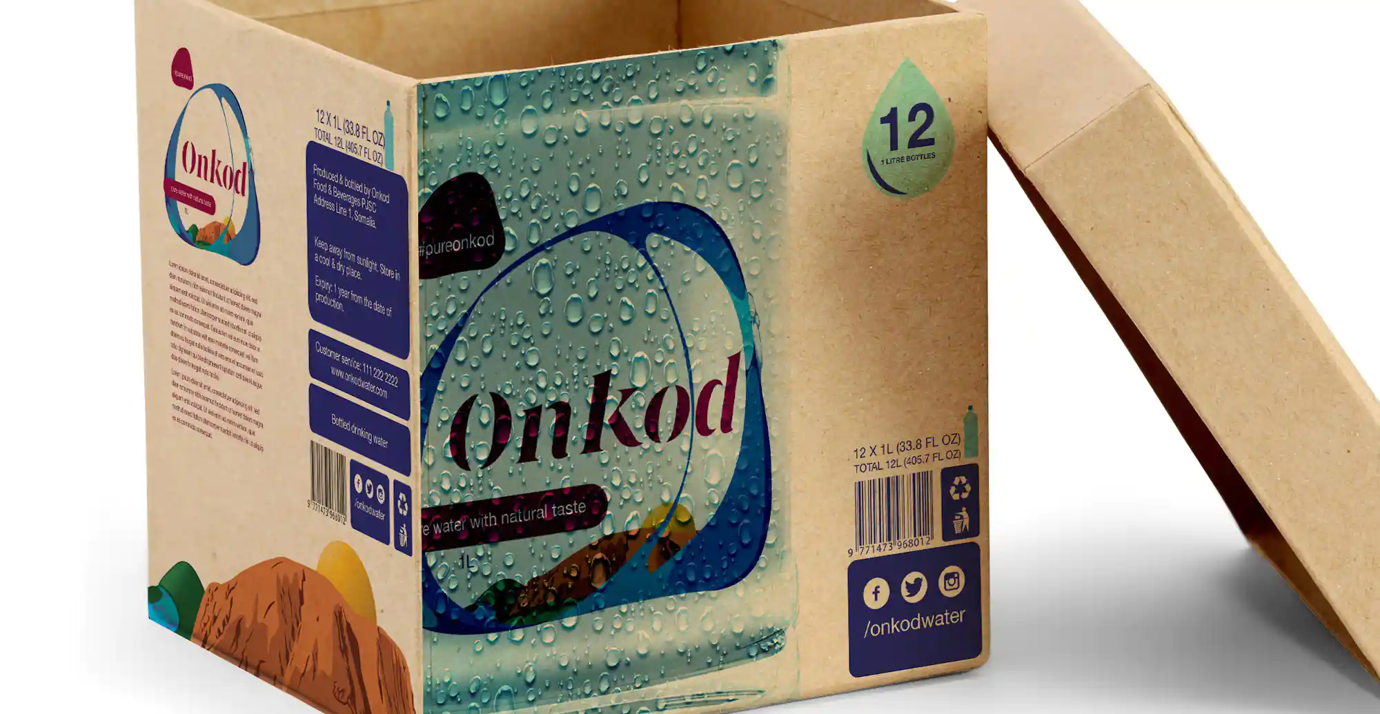
Coming from an environment of dusty landscapes, Onkod (meaning ‘storm’ locally) met with Marrow with a view to shake up the category, not just with its superior product but by standing apart from the crowd of normality.


Coming from an environment of dusty landscapes, Onkod (meaning ‘storm’ locally) met with Marrow with a view to shake up the category, not just with its superior product but by standing apart from the crowd of normality.