How to Choose Brand Typography That Balances Character and Clarity
Brand typography should do more than make communication look attractive. It must express character, organise information and remain clear across digital, print, physical and bilingual applications.
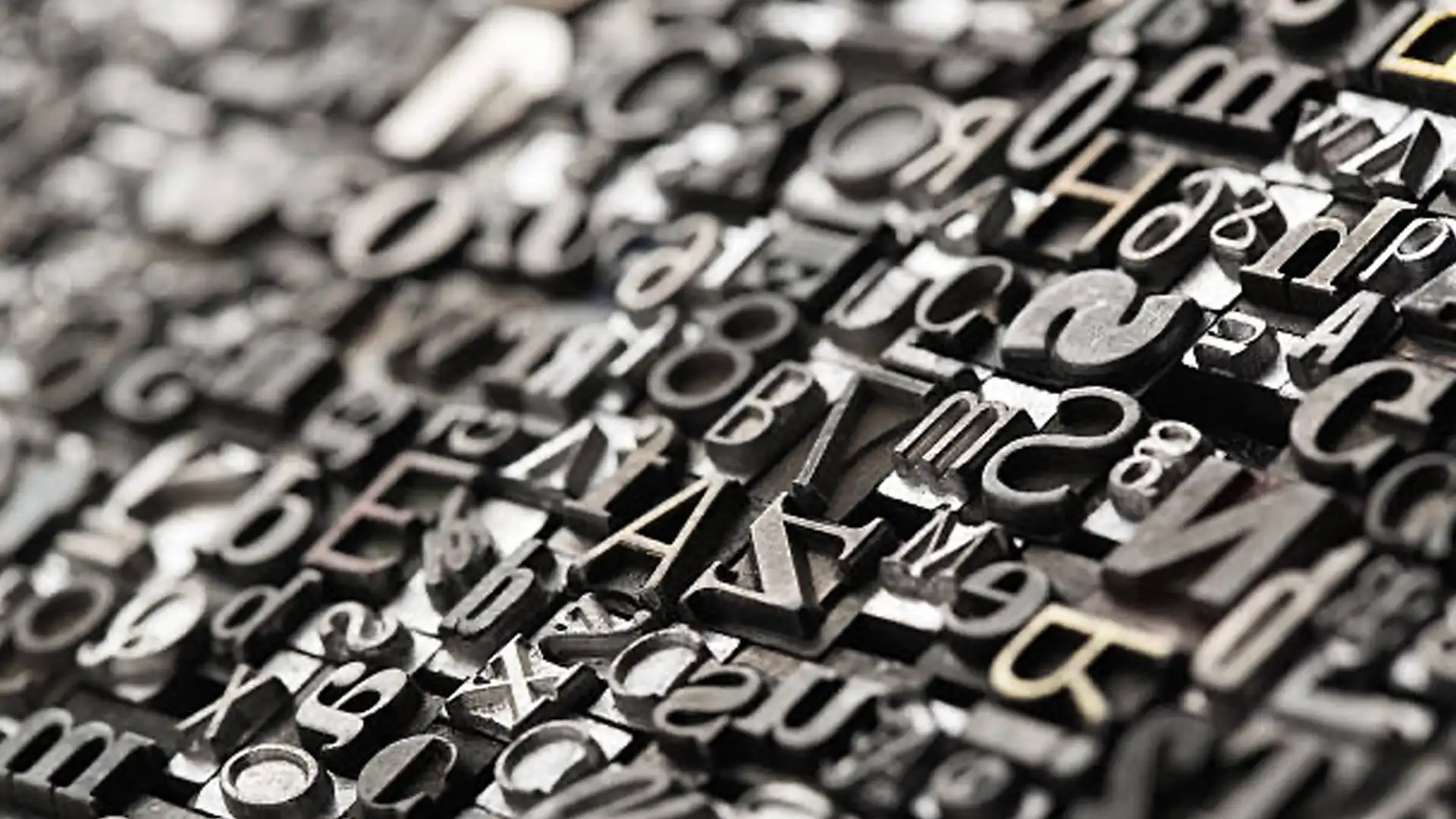
Typography gives written language a visual voice.
Before someone reads a headline, the typeface has already begun shaping how the message feels.
It may appear authoritative, contemporary, warm, technical, restrained or expressive. It can make complex information easier to navigate or turn simple communication into unnecessary effort.
This makes typography one of the most influential elements within a visual identity.
Yet brand font selection is often approached as a matter of taste.
Teams choose a typeface because it looks modern, premium or different, then discover that it lacks the weights, language support or digital performance required by the organisation.
An effective brand typography system needs to balance character with clarity.
It should express the brand’s position while remaining practical across the many situations in which people need to read, understand and use its communication.
What Is Brand Typography?
Brand typography is the system of typefaces, styles and principles an organisation uses to present written language visually.
It includes more than the selection of a primary font.
A typography system may define:
Display and body typefaces, font families, weights, sizes, line spacing, letter spacing, hierarchy, alignment, emphasis, numerical styles and language-specific applications.
It should also explain how typography changes across websites, presentations, reports, social content, packaging, signage and other environments.
The objective is to make communication feel recognisable and organised without sacrificing readability.
Why Typography Matters to Brand Recognition
Typography often occupies more space than the logo in everyday communication.
A website may display the logo once while using hundreds of headlines, labels and paragraphs. A presentation, report or social post may be recognised largely through its typographic style.
Consistent typography can therefore become a strong visual signature.
People may begin to recognise the way headlines are constructed, the contrast between display and body text or the spacing and rhythm of a layout.
This recognition depends on more than choosing an unusual font.
It comes from applying a clear typographic system repeatedly.
Typography Should Begin With Brand Strategy
Typeface selection should begin with the perception the brand needs to create.
A brand positioned around clarity and expertise may require typography that feels precise, assured and highly legible. A cultural or lifestyle brand may have greater room for expressive forms. A premium brand may communicate confidence through restraint rather than ornament.
The strategic characteristics should be translated into typographic criteria.
Instead of asking for a “modern font”, consider what modernity should mean for this brand. Does it mean technological efficiency, cultural relevance, visual simplicity or a break from traditional category conventions?
Specific criteria create better design decisions than broad stylistic labels.
Understand the Main Typeface Categories
Typefaces are often grouped into broad classifications. Each category contains substantial variation, but understanding the general distinctions can support exploration.
Serif typefaces include small strokes or structural details at the ends of letterforms. They may communicate heritage, editorial sophistication, authority or warmth, depending on their design.
Sans-serif typefaces remove those traditional details. They can feel contemporary, direct, functional or neutral, but not every sans-serif is modern and not every serif is traditional.
Slab serifs use heavier and more geometric serif forms. They may create strength, confidence or an industrial character.
Display typefaces are designed to create greater personality or impact at larger sizes. They are not always suitable for extended reading.
Monospaced typefaces give every character equal horizontal width. They may suggest technology, systems or technical documentation.
Script and handwritten typefaces can communicate personality, craft or informality but require restraint and careful readability testing.
Classification provides a starting point. The individual characteristics of the typeface determine the final expression.
Avoid Treating Serif and Sans-Serif as Simple Opposites
Typography discussions often reduce the choice to traditional serif versus modern sans-serif.
This distinction is too simplistic.
A contemporary serif can feel progressive, while a geometric sans-serif may reference design traditions that are nearly a century old.
Proportion, contrast, terminals, curves, spacing and weight all influence personality.
The brand should evaluate the specific typeface rather than relying only on its broad category.
Audit the Category’s Typographic Conventions
Industries tend to develop typographic habits.
Technology brands frequently use geometric or neutral sans-serifs. Luxury brands often rely on high-contrast serifs and generous spacing. Professional services may use restrained typography designed to communicate authority.
These conventions can help customers recognise the category.
They can also make competing brands appear visually similar.
A competitive audit should examine the typefaces, weights, headline styles and hierarchy used across the market.
The objective is to understand where familiarity supports trust and where a different typographic direction could create stronger recognition.
Define the Functional Requirements
A typeface may look appropriate in a headline and still fail the organisation’s practical needs.
Before selection, establish where typography must work.
Consider:
Websites, mobile applications, presentation software, reports, packaging, signage, environmental graphics, interfaces, email, social media, technical documents and internal office applications.
Determine which languages and scripts are required. Assess whether the brand needs extensive numerical characters, mathematical symbols, technical notation or specialised currency marks.
The functional brief prevents the team from choosing a typeface that performs beautifully in a brand presentation but poorly in daily use.
Choose Between One Family and a Typeface Pairing
Some brands can build their entire system around one flexible type family.
A comprehensive family may include numerous weights, widths and styles, allowing it to create hierarchy while maintaining strong consistency.
Other brands benefit from pairing two typefaces.
A distinctive display face may create character in headlines, while a highly legible text face supports longer reading and functional communication.
The pairing should create purposeful contrast without making the identity feel divided.
The typefaces might share proportions, shapes or historical influences while differing enough to perform distinct roles.
Adding more typefaces should require a clear functional reason. Variety alone rarely improves the system.
Select a Typeface With Sufficient Range
A brand typography system often needs more flexibility than expected.
Different weights may be required for headlines, body text, captions, buttons, data and emphasis. Italics can support editorial communication. Condensed styles may help with narrow layouts or signage.
A type family with limited styles can force the organisation to introduce unrelated fonts later.
Review the complete family before approving the primary style.
Consider whether the light and heavy weights remain legible, whether italics are genuinely designed and whether the family contains the characters required by the organisation.
Prioritise Readability
Typography exists to be read.
A distinctive typeface loses value if people struggle to process the content.
Readability is influenced by letterform clarity, character spacing, size, line length, line spacing, contrast and the surrounding layout.
Test the typeface with real copy rather than placeholder text. Include short headlines, long paragraphs, numbers, names, technical terminology and interface labels.
A display typeface may be effective for a few words but exhausting across a paragraph. A body typeface may feel understated at large sizes but perform exceptionally well in extended reading.
Each typeface should be used where its strengths are most valuable.
Check Similar Characters
Some typefaces contain characters that are difficult to distinguish.
Lowercase “l”, uppercase “I” and the number “1” may appear almost identical. The letter “O” and number “0” can create similar confusion.
This matters in websites, forms, passwords, data tables, technical specifications and financial communication.
A typeface used by an engineering, financial or technology brand may require greater character distinction than one used mainly in expressive campaigns.
Testing should reflect the information the organisation actually communicates.
Build a Clear Typographic Hierarchy
Hierarchy helps people understand which information matters most and how different ideas relate.
A typography system should define the visual roles of:
Primary headlines, secondary headings, introductions, body copy, captions, quotations, labels, buttons and data.
Hierarchy can be created through size, weight, spacing, colour and position.
Using too many signals at once can create visual noise. A headline does not always need to be larger, bolder, uppercase and a different colour.
The system should create clear levels through disciplined contrast.
Control Line Length and Spacing
The typeface alone does not determine readability.
Line length and spacing influence how easily people move through text.
Lines that are too long make it difficult to find the beginning of the next line. Very short lines interrupt reading rhythm.
Insufficient line spacing makes paragraphs feel dense, while excessive spacing disconnects related lines.
Letter spacing may need adjustment at large headline sizes or when uppercase text is used.
Typography guidelines should include principles for these relationships rather than specifying only font names and sizes.
Use Uppercase Deliberately
Uppercase typography can create authority, emphasis or a strong graphic presence.
It can also reduce readability when used extensively.
Long paragraphs and interface labels written entirely in capitals are more difficult to scan because the word shapes become less varied.
If uppercase is part of the brand’s distinctive style, define where it is appropriate and how spacing should be handled.
A strong visual device becomes less effective when applied everywhere.
Consider Numbers and Data
Numbers play an important role in many organisations.
Financial brands, property businesses, manufacturers, consultancies and technology companies regularly present prices, specifications, measurements, statistics and tables.
Review how the typeface handles numerical information.
Tabular figures align vertically and improve comparison in tables. Proportional figures may appear more natural within sentences. Different contexts may require both.
Currency symbols, decimal points and percentage signs should also be tested.
A typeface that performs well in headlines may not necessarily support data-heavy communication.
Design English and Arabic Typography Together
For brands operating in the UAE and GCC, bilingual typography should be developed as one system.
The Arabic typeface should not be selected after the English identity has already been completed.
Both scripts need to work together in visual weight, proportion, character and hierarchy.
The aim is not to find Arabic and Latin letterforms that look artificially identical. Each script has its own history, structure and rhythm.
The pairing should feel compatible while respecting the integrity of both languages.
Headline strength, body-text readability and overall visual authority should remain balanced when English and Arabic appear together.
Account for Right-to-Left Layout
Arabic typography affects more than the choice of font.
Layouts need to respond to right-to-left reading, alignment, content order and the direction of visual movement.
A bilingual system should define how English and Arabic sit beside or above one another, how mixed-language content is handled and how hierarchy remains consistent across both directions.
Simply reversing an English layout may not produce a natural Arabic composition.
Both versions should be designed and tested with real content.
Consider Other Language Requirements
Many organisations communicate across several countries and language groups.
The typeface should support all required characters, accents and scripts.
A font may cover basic English while lacking the diacritics required for European languages or complete character sets for regional communication.
Fallback fonts should be selected deliberately if one family cannot support every language.
Unplanned system substitutions can create significant inconsistency across websites, presentations and documents.
Review Font Licensing Carefully
Typeface licensing determines where and how the font can legally be used.
Different licences may be required for desktop installation, websites, applications, digital advertising, broadcasting, packaging or distribution within templates.
The organisation should understand:
How many users require access, whether agencies and suppliers are covered, which domains are included and whether the licence supports future growth.
A seemingly affordable typeface can become expensive when deployed across a large organisation or digital product.
Licensing should be considered before the system is approved, not after the identity has been launched.
Evaluate Free and Open-Source Fonts Properly
Free and open-source typefaces can provide excellent quality and broad accessibility.
They may be especially practical for organisations with many users or external partners.
However, “free” does not automatically mean suitable.
Review the licence, character set, language support, available weights, technical construction and future maintenance.
Some widely used free fonts may also provide limited distinctiveness because they appear across many unrelated brands.
The decision should balance quality, ownership, accessibility and operational requirements.
Consider a Custom Typeface or Customisation
A custom typeface can provide greater ownership and respond precisely to the brand’s functional needs.
It may support multiple scripts, specialised characters or digital environments that existing fonts do not address effectively.
However, custom development requires time, investment, technical expertise and ongoing management.
Not every brand needs a fully bespoke family.
Customising selected letterforms, developing a distinctive display alphabet or commissioning a limited set of typographic assets may create sufficient ownership when supported by appropriate licensing.
The level of customisation should reflect the role typography plays within the identity.
Test Digital Performance
Web typography affects both brand expression and website performance.
Large font files, numerous weights and multiple language sets can increase page load time.
The system should identify which styles are genuinely necessary and how they will be delivered efficiently.
Variable fonts may provide a broad range of weights or widths within fewer files, although browser support and implementation still require testing.
The typeface should be assessed across devices, browsers and screen resolutions.
A font that appears refined on a large desktop screen may lose clarity on a smaller mobile display.
Use Fallback Fonts Intentionally
Digital and office environments may not always load or support the primary brand typeface.
A fallback font will then appear.
If that substitute has very different proportions, layouts may change, lines may wrap unexpectedly and the communication may lose much of its intended character.
Choose fallback fonts that share relevant characteristics with the primary family.
Guidelines should identify appropriate substitutes for websites, email, presentations and internal documents.
Fallback typography is part of the system, not an afterthought.
Design for Office Applications
Employees create a significant amount of communication through presentation, document and spreadsheet software.
If the brand typeface is difficult to install, licence or share, people will use whatever font is available.
The typography system may therefore need an office-safe alternative that works across common devices and platforms.
This alternative should preserve the general clarity and character of the identity without creating technical obstacles for everyday work.
A slightly less distinctive but consistently used office font may be more valuable than an ideal typeface nobody can access.
Design for Accessibility
Accessible typography helps more people read and understand the brand’s communication.
Consider character clarity, appropriate font sizes, line spacing, text contrast and the use of decorative type.
Very thin weights may disappear on screens or against complex backgrounds. Condensed type can reduce readability in longer text. Excessive centred copy may make paragraphs difficult to follow.
Accessibility does not mean every brand must use the same neutral typeface.
It means balancing expression with the responsibility to communicate clearly.
Test Typography With Real Content
Type specimens often use carefully selected words designed to make the font look its best.
Brand typography should be tested with the content the organisation actually produces.
Use:
Long and short headlines, body paragraphs, customer names, product names, technical specifications, numbers, prices, quotations, buttons and bilingual copy.
Test both ideal and difficult examples.
A strong type system should handle ordinary communication as effectively as high-profile campaigns.
Build Responsive Typographic Rules
Typography needs to adapt across screen sizes.
A headline that works on a desktop may become oversized or break awkwardly on mobile. Body text must remain readable without forcing users to zoom.
Responsive systems can define how sizes, line heights and spacing change across different viewports.
The hierarchy should remain clear even when the scale changes.
This is more effective than simply reducing every element by the same percentage.
Create Typography Guidelines That People Can Use
The guidelines should explain both the selected typefaces and the principles governing them.
They may include:
Typeface roles, approved weights, hierarchy, sizes, spacing, alignment, capitalisation, colour combinations, bilingual relationships, fallback fonts and channel-specific examples.
Practical guidance should distinguish between fixed standards and areas where designers can exercise judgment.
A rigid collection of specifications cannot anticipate every future application. The principles help teams make appropriate decisions when new needs arise.
Embed Typography Into Templates and Design Systems
Typography becomes consistent when correct styles are built into the tools people use.
Website components, presentation masters, document templates, social layouts and design libraries should contain approved type settings.
This reduces manual formatting and prevents small inconsistencies from spreading.
Teams should not need to remember every font size and spacing value. The system should make correct application straightforward.
Create Typography Governance
Without governance, typography systems gradually expand.
Teams introduce new typefaces for campaigns, events or presentations. Temporary choices become permanent because files are reused.
The organisation should define who can approve new typefaces and when exceptions are justified.
Campaigns may have room for additional expressive typography, but their relationship with the core brand should remain visible.
Governance protects recognition while allowing the identity to evolve.
Know When Brand Typography Needs to Change
A typography system may require review when it no longer supports the positioning, lacks necessary language coverage or performs poorly in digital environments.
Licensing may become impractical as the organisation grows. Accessibility problems may become more apparent. A limited font family may struggle to support an expanding range of communication.
A complete replacement is not always necessary.
The organisation may retain a recognisable display typeface while introducing a more functional body family or improving hierarchy and application rules.
The degree of change should reflect the problem and any equity already established.
Common Brand Typography Mistakes
One common mistake is choosing a typeface entirely for its personality without testing readability or functionality.
Another is selecting too many fonts in an attempt to create variety. The result is usually inconsistency rather than richness.
Some organisations ignore language requirements until late in development, forcing an Arabic or multilingual system to adapt to decisions made for English alone.
Others overlook licensing, digital performance and office availability until implementation begins.
There is also a risk of specifying a primary typeface without defining hierarchy, spacing or fallback options.
Finally, brands may use distinctive typography only in launch materials while everyday presentations, reports and digital communication revert to unrelated defaults.
Typography Turns Language Into a Recognisable Experience
Brand typography must do two things well.
It must express character, and it must help people read.
The strongest systems do not treat these objectives as opposites. They use expressive typography where it creates value and functional typography where clarity must lead.
Choosing the right system requires strategic understanding, typographic judgment and practical testing across languages, channels and applications.
The typeface is only the beginning.
Hierarchy, spacing, scale and disciplined implementation determine whether typography becomes a genuine brand asset.
At Red Marrow, we help organisations build typography systems that connect visual character with clarity, usability and multilingual performance. Because the way a brand looks when it speaks can be as recognisable as the words themselves.
“`